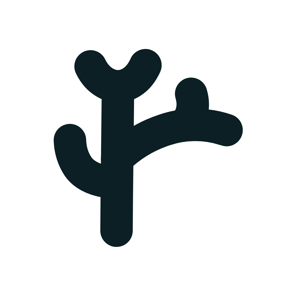
One coral, out of a whole reef
Six round-capped strokes, one circle. This page is the whole of it — the shape, the rules, and the sentence you would need to draw it again without any of our files.
How it is built
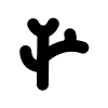
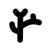
One stem, a two-lobed crown, an arm reaching down-left, a branch reaching right with a small spur above it. Every stroke shares one width — even weight is the mark's character, so no part is ever thickened or thinned on its own.
- Stem · 1
- Crown · 2 lobes
- Arm · 1
- Branch + spur · 2
- viewBox 100×100
- r = 46
- stroke = 11
- pathLength = 100
- ½ branch · ⅔ arm
Origin · how it evolved
This coral is not only a coral. Four steps, from a whole reef face to a single mark that breathes — and the finished form hides feelreef's own initials.
- ①
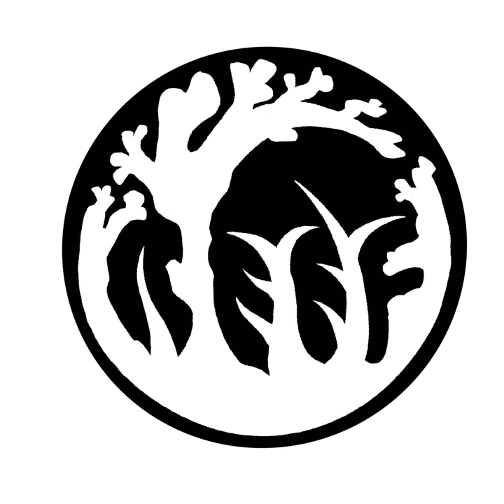 Figure-ground reversal · REEF hidden inside A letter game: the four letters of REEF hide in the negative space of a whole reef face.
 - ②
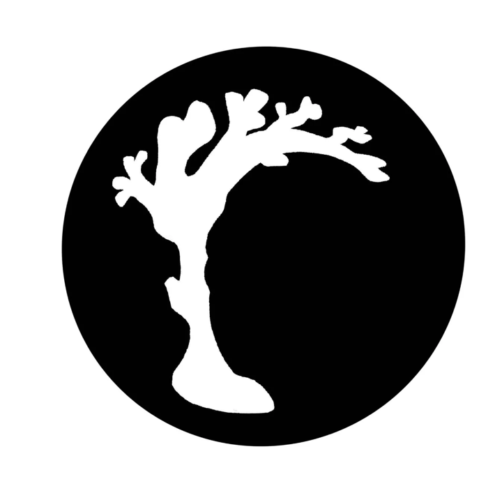 Take the largest polyp · the 「r」 The biggest, most upright polyp is the leading r. Too full — it blurs at small sizes, so it converges toward the essentials.
 - ③
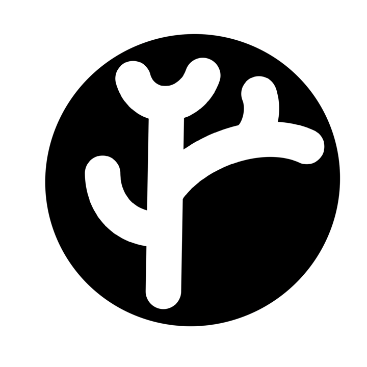 Hand-drawn study This is where the six strokes get their posture: the short fat U, the shoulder of the 「r」, the little spur reaching right.
 - ④ Vector master · f + r fused f = the upright stem · r = the right branch and its spur — scalable without limit, and able to move.
From a figure-ground REEF (taking the largest polyp as the 「r」) to today's fused f+r — the letters are always hiding in the shape, and none of them jumps out shouting 「I am a letter」. Spotting it is an easter egg; missing it just leaves you a good-looking coral.
One silhouette, several fills
The silhouette does not move a millimetre — only the fill layer changes. The top row is the four official dresses for everyday digital; the bottom row is for paper and special surfaces.
Everyday digital — the four official dresses
Paper and special surfaces
Container and breathing room
The coral sits centred in its frame with even room to breathe on all sides. The true circle is the primary container; the squircle stands in for it wherever an app icon is called for.
The wordmark
Always lowercase, always Young Serif, always beside the badge with a gap of about a third of the badge's diameter. Three published dresses: the growth gradient leads, the coral sunset is for dark grounds, and the knocked-out one rides a gradient band.
REEF with X · the module naming system
Every module belongs to the 「REEF with X」 family — the same coral, the same REEF, the same joining word. Only the capability name at the end and its own colour change.
RiseEmergeEvolveFlourish — where REEF comes from, and where this series got its name.
Each lockup is ONE colour — the coral badge, REEF, and the capability name all share the module's own colour, and only `with` stays grey. The free entry point Card is green, the core Site is ocean, the money pair Checkout / Members are green and coral, and the AI pair GAIDO / KAITO are both purple. The badge and REEF are always the same colour, which is why a lockup reads as one object.
A recipe, not a file
Marks that last are carried as instructions, not as assets — a family crest survives six centuries of hand-carving because carvers were told what it is, not sent a copy. So the coral has its own escape hatch: one sentence rebuilds the whole plant, with no file, no vendor, and no us.
A coral in a circle: one stem stands upright, splitting at the top into two short round lobes. Halfway up, a branch reaches right with a small spur pointing skyward; two-thirds up, an arm hangs down to the left, curved like a hook. The three lobes all come from one arc. Six strokes in all, even width, round ends.
- ½ branch
- ⅔ arm
- ⅐ crown
- ×3 one mother arc ×3
Not one of the marks that survived a thousand years did it by being archived — they did it by being a sentence anyone could rebuild the whole thing from. This is not a fifth shape: the shape is the one above. What changes is the medium it travels in.
Said plainly: nobody can design a shape guaranteed to last a thousand years — what can be designed is how it travels. Shell's logo was redrawn eight times in a century without dying; family crests were hand-cut by countless craftsmen for six hundred years without losing themselves. Both relied on the same thing: an invariant, plus permission to redraw. Here the invariant is the topology (how six strokes relate), the fractional ratios, and one mother arc; everything else each generation is allowed to reinterpret. And it refuses to drop the arm or the spur to be 「more timeless」 — that would make it an anonymous tree. The marks that lasted a thousand years are all distinctive AND rebuildable, not minimal. Which is, conveniently, feelreef's own genetics: the logo carries its own escape hatch — it needs no file and it does not need us to be alive; one sentence takes it with you.
Using it
- No shadows, no added gradients
- Never squash or stretch it
- No low-contrast colour pairings
- Do not rotate it (the sway excepted)
It moves three ways
entrance · once · 1.8s · ease-out · in growth orderidle · loop · 3.2–4.4s · ease-in-outloading / AI thinking · loop · 3.6s · ease-in-outThe files
Four SVGs, and you are welcome to them: the ocean badge, a mono version for stamps and single-colour printing, the glyph alone which takes the colour of the text around it, and a squircle for app icons.
Vector


Bitmap
For anywhere that will not take an SVG — a GitHub or Slack avatar, an npm package, an app listing. The square one is full-bleed on purpose: those services crop and round it themselves, so a transparent PNG with a circle in it ends up as a circle inside a circle.